Dimensions of luxury as a post came together thinking about fictional influence account Gstaad Guy, Horizon Catalyst’s New Codes of Luxury report and Sense Worldwide’s Future of Luxury report.

Dimensions of luxury breaks down into three areas which Catalyst calls:
- Traditional luxury
- Contemporary luxury
- Personal luxury
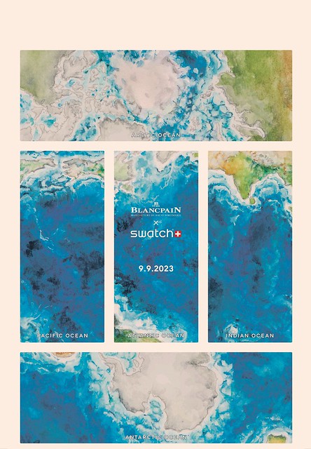
Nowadays, most luxury brands won’t fit neatly into these classifications. For instance the Swiss watch brand Blancpain would be considered to be traditional luxury, but the Swatch x Blancpain collaboration which borrows the design language of the 50 Fathoms dive watch is very much contemporary luxury. Part of this has been driven by many brands being part of large combines:
- LVMH – depending when you look at the stock price, Europe’s largest company by value run by Bernard Arnault. Related to L Catterton private equity fund which has been financed deals such as Birkenstocks.
- Kering – LVMH’s rival best known for Gucci. It is currently run by François-Henri Pinault
- Richemont – Swiss listed group focused more on jewellery and watches than rivals. It has a range of brands including Dunhill, Montblanc and Panerai.
- Swatch Group – which owns most of Switzerland’s premier watch brands
- Fosun – China-based multi-sector conglomerate which owns a hodge podge of western heritage and luxury brands including Ahava, Folli Follie, Lanvin, Sergio Rossi, Silver Cross prams and St John knitwear.
Notable independents include The Rolex Trust and Hermés.
Traditional luxury
Unsurprisingly this is the kind of luxury that most people would think of. Timeless style, heirloom designs and peerless quality are likely to be the kind of language that springs to mind. When the luxury industry talks about sustainability and the circular economy, the lives of these traditional luxury products come into focus, since they are often passed down. The influencer behind Gstaad Guy in an interview with the FT talks about his favourite item of clothing being a Loro Piana vest that was his Grandad’s.
What we think of as ‘traditional’ luxury brands came out of businesses with heritage that are known for their quality
- Loro Piana and Zegna were both high end fabric manufacturers before becoming ‘luxury brands’
- Rolex made high quality reliable tool watches, as did Omega and Panerai.
- Louis Vuitton made high quality robust trunks for travellers.
- Zero Halliburton and Rimowa made cases that were ideal for air travel and protecting sensitive instruments and camera equipment. The Halliburton in Zero Halliburton actually refers to Halliburton Company who are famous for providing oilfield services.
Contemporary luxury
Contemporary luxury is where the greatest controversies of luxury tend to lie. Horizon Catalyst tend to tie up premium brands like AirBnB and Apple together with the luxury sector. It includes values like innovation and sustainability. But it doesn’t discuss what Dana Thomas calls the massification of luxury, with traditional European brands being more often being ‘Made In China’. This has driven a drive for brands to try and ‘shortcut’ their way to success. Luxury brands have adopted the techniques of streetwear brands were scarcity and limited drops fuel the ‘hype’. What Sense Worldwide called ‘Supremification’. Chanel is opening special UHNWI only boutiques. And ‘Made In China’ allowed China to develop its own ateliers.
Personal luxury
Catalyst defines personal luxury as subjective in nature, individual to each person and having a deeper connection with personal values. It could be items that might be considered treats like having their groceries delivered. Their discussion of everyday luxury would be familiar to marketers in terms of the ‘Lipstick effect’ familiar from Juliet Schor’s work during recessions. But it’s interesting that luxury is being defined by consumers and followed by brands. The classic example of this would be brands from Nike to LVMH getting on board with NFTs, following consumers and creators.
Further information
Best of Tatler Hong Kong: The price of viral fashion | Tatler Asia
Luxury Brands | Cultural Shifts | Horizon Catalyst
Future of Luxury | Sense Worldwide
Deluxe: How Luxury Lost its Lustre by Dana Thomas
Louis Vuitton, Supreme: streetwear & luxury brands | renaissance chambara
Gstaad Guy, the man who turned a lifestyle parody into a luxury brand | FT How To Spend It magazine
Something New For The 1%: Private Chanel Stores | Highsnobriety
The Overspent American by Juliet Schor