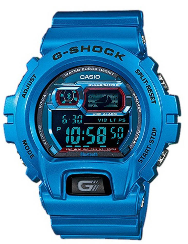
At the beginning of the month I took the plunge and decided to buy a Casio G-Shock connected watch. After a week or of wearing a smart watch, I have a pretty good sense of the pros and cons of using it.
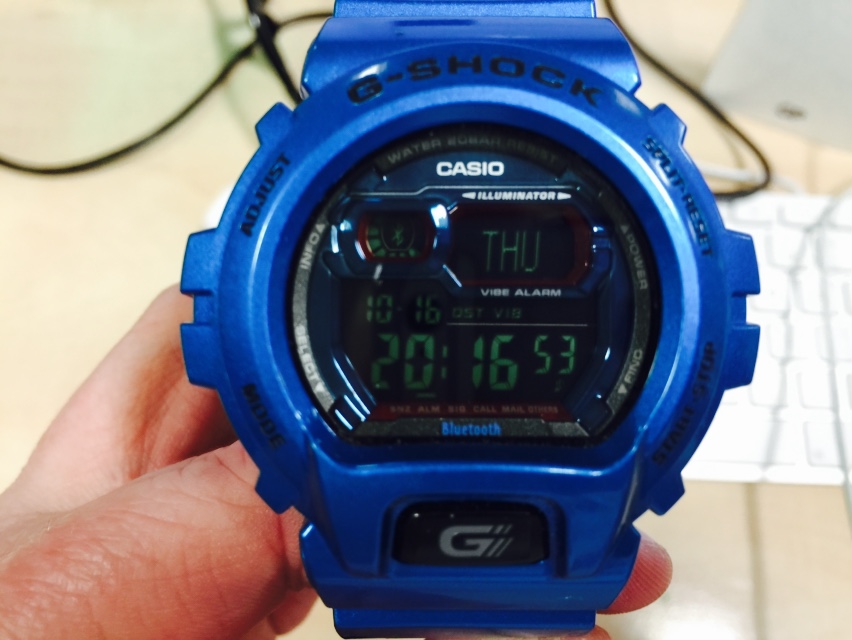
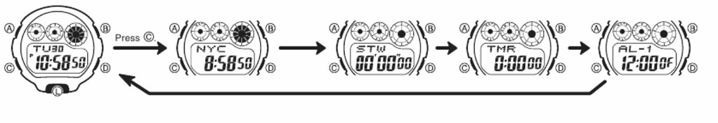
The connection with the iPhone makes a major leap forward in the G-Shock experience. Using a G-Shock is rather like using an old computer system like a DEC VAX minicomputer, the experience is modal. Everything revolves around combinations of button pushes to get to the functionality of the watch. Realistically you can’t navigate this process while wearing a smart watch. The manual is a quarter of an inch thick and the commands not exactly memorable. If you have clumsy fingers or are not paying attention you have to cycle through the complete set of button commands again
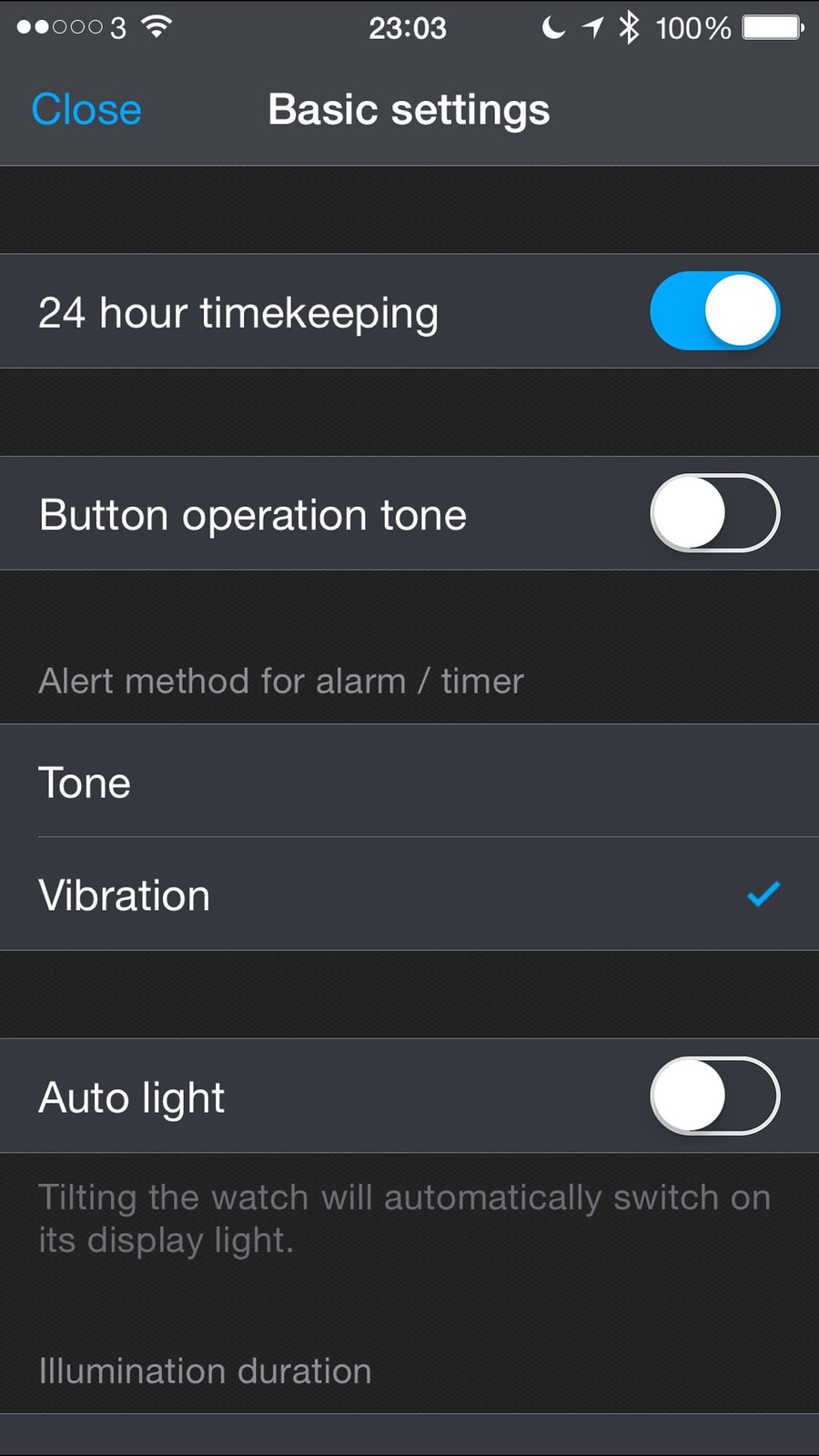
The G+ iPhone application deals with every setting on the watch bar setting the time and date itself (which still requires a bit of button juggling).
The achilles heel is battery life. Most of the facilities about the watch are about husbanding a relatively meagre lithium ion battery. What Casio’s engineers managed to achieve is imperfect but impressive. The battery life is the silent hand that ruled all aspects of the product design. In order to have a sealed in battery that lasted more than a day, Casio had to go with an old school battery. Out went modern G-Shock features such as the GPS module and atomic clock radio units used to provide accurate time based on location.
Out too went the solar power option. Alerts seem to be polled every quarter of an hour for things like email. But then in this connected age, having a message to let me know that I don’t have email would be more noteworthy.
This all had a number of effects:
- The watch didn’t alert me to everything – that isn’t a bad thing. I do want my alerts to be consistent, so I shut down alerts from everything but Twitter, calendar and calls. I would have loved to have alerts for WeChat, SMS / iMessage messages, FaceTime and Skype calls but they aren’t on the programme (so far)
- The watch did cure ‘phantom’ rings. I got to ignore ringtones out in public and at home unless my wrist shook. It also worked well when I couldn’t feel my phone vibrating in my Carhartt jacket
- I remembered to take my phone with me on more occasions, the watch would vibrate if the Bluetooth link was broken
The best bit of the phone for me was that it was still a G-Shock, it could be worn in the gym, the shower, whilst shaving, washing dishes or swimming. It is a watch for living rather than a Bluetooth-enabled human leash.
More information
On smart watches, I’ve decided to take the plunge