Blog

  • Made in China brand thoughts

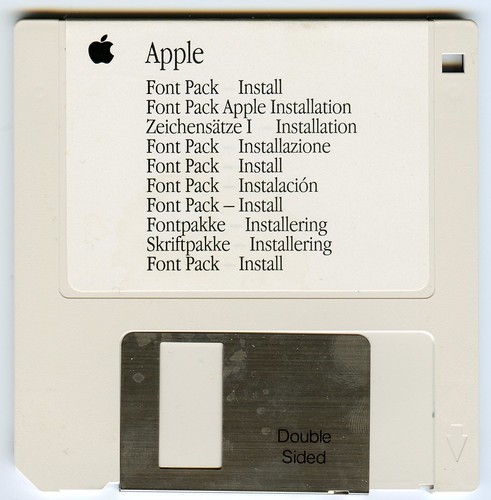
    Made in China tends to mean cheap, and possibly nasty. But that doesn’t mean that it will always be the case. Companies like Apple go Made in China because there are manufacturing capabilities in Taiwanese owned factories that aren’t anywhere else.

    Thinking about the future of Made In China; it makes sense to go back into industrial history.

    Its hard to think now that ‘Made in Germany‘ did not stand for excellence, especially when we think about brands like Zeiss, Leica, Miele, Siemens and Daimler-Benz. But at the beginning of the 20th century ‘Made in Germany‘ stood for cheap and tasteless products.

    China is in a similar situation, despite being the workshop of the world for all intends and purposes and coming out with some of the world’s most iconic and innovative devices ‘Made in China‘ is still perceived as poor-quality and cheap. All of Apple’s products are made in China but proclaim ‘Designed by Apple in California‘. So maybe China could learn something from early-20th century Germany?

    Germany got out of its low quality reputation over a few decades (about the length of the Chinese economic miracle) by forming an organisation with a mix of members drawn from artists, designers and big industry called Deutscher Werkbund.  The Deutscher Werkbund was originally a combination of a lobby group, standards body and catalyst for good design across all disciplines. It encompassed product design, factories, typography and industrial standards. Their members did landmark work for industrial titans like AEG, Bosch and Volkswagen.

    Quality was at the centre of everything that they did. Products became sophisticated in their design. They put a lot of thought into how an identity was instilled through design into the most boring of objects.

    An unintended side-effect of the  effort of the Deutsche Werkbund was that Germany had a sound industrial infrastructure that the national socialist government took advantage of. The German government closed down the Werkbund in 1938. But it also laid the foundation of the German post-war miracle, the government reinstated the Werkbund in 1949.

    China has a government that can make things happen, the companies, the engineering talent, legions of artists and many great designers – it is just a matter of putting these groups together and giving them the permission to do something really great. More on design here.

  • Wonder Girls

    The Wonder Girls caused me to reflect on pop music as a business. We are so used to manufactured pop music artists by the likes of Tom Watkins, Stock | Aitken | Waterman and more recently Simon Fuller’s 19 Entertainment. Some of these groups like Wham, Kylie Minogue and Take That had international success. We have gotten used to the dominance of western international recording artists.

    Wonder Girls Daum

     Wonder Girls Korean fan site.

    It is this heritage that makes the Wonder Girls phenomena: a Korean girl-band managed by a Korean team getting a Billboard top 100 hit all the more remarkable.

    Wonder Girls MySpace

    Wonder Girls MySpace page

    That kind of success takes more than talent and good looks – the world music industry is littered with talented beautiful failures. The Wonder Girls are creatures of the internet age, they started off conventionally enough in South Korea and then used their South Korean fan base to spring board into the US marketplace.

    There were two parts in this story which made a great use of social media:

    You could argue that they are a part of the ongoing Korean Wave: a rise in popularity of Korean music, television and film culture which has swept Asia and started to gain popularity in the west like the Japanese film, manga and anime industries before it.

    Wonder Girls Facebook

    Wonder Girls Facebook page

    However where the group breaks rank with the Korean Wave is in the proactive targeted nature of their marketing; which is more reminiscent of aggression and entrepreneurship of the Japanese car, camera and consumer electronics industries which shook things up in the 1960s and 1970s. More related content here.

  • Whole Earth Discipline

    One of the problems that I have with many environmental tracts is that they articulate their message as an anti-science based dogma rather than as a discussion where you can make your own mind up. That issue and Stewart Brand’s status as a nexus point between green issues, counterculture, technology, web communities and futurism made Whole Earth Discipline a must-read book book for me.

    The whole earth of the title is a nod to history: The story goes that Brand inspired by the use of acid started a campaign to get a photograph of the whole earth published. He sold badges with Why haven’t we seen a photograph of the whole Earth yet? on them and found a grassroots movement around it. He rightly summised the image would be a powerful symbol. This was a key point in the history of the modern green movement.

    Stewart was responsible for publishing The Whole Earth Catalog and The WELL (Whole Earth ‘Lectronic Link). The Whole Earth Catalog was a regularly published book of useful information not mediated by authority that sprang out of hippie culture – a kind of Wikipedia of its day. The WELL is the proto-social network which connected a diverse range of technocrats, artists and journalists who would go on to play an important part in the modern web and set the libertarian point-of-view of the digerati – its got some great content on there and I would recommend that anyone interested join – my user name is ged if you want to reach out to me there. The netizen mantra that information wants to be free was taken from a speech that Brand gave in 1984 at the first Hackers Conference.

    If you want to know more about Stewart I can recommend Fred Turner’s From Counterculture to Cyberculture: Stewart Brand, the Whole Earth Network, and the Rise of Digital Utopianism. Its a big book but a great read that I completed cover-to-cover one time on a flight to Hong Kong.

    Whole Earth Discipline breaks down into two distinct parts. The first part builds on the famous Environmental Heresies essay that Brand published in the MIT Technology Review five years ago. He brings this up to date by surveying the current knowledge on the planet and the solutions that we are likely to require such as widespread use of nuclear power, the use of solar energy as a personal household level and encouraging populations into cities, away from sprawling suburbs.

    The second part of the book is demystifying some of the current green dogmas like the evils of genetic modification with a critical eye and taking an unvarnished look at some of the most prominent campaigning organisations out there such as Greenpeace and Friends of The Earth.  According to Brand tens of thousands of people died of starvation in Zambia because of a lobbying campaign to the country’s leadership by environmentalists complaining about poison Frankenfoods.

    The book is a thoughtful, engaging, well-researched book on environmental issues that we all face together with ideas on how to address current and future challenges. It is also valuable for communications people working in difficult areas such as energy and biotechnology who are often faced with dogma-based campaigns by well-meaning but misguided organisations. More book reviews can be found here.

  • Kin logo

    Whilst I won’t be dashing out and getting myself one of the Microsoft | Sharp Kin phones. I did like the Kin logo. The logo seems to be completely unrelated to the devices. It’s an atemporal brand design it would be easy to produce on screen, as an app icon or in print and also looks as if it draws heavily on Asian influence. 

    You wouldn’t need to be able to read the characters to at least recognise the brand. With that in mind it would work in markets around the world. 

    All of that is makes for a really challenging design brief and the work done on the Kin logo is very impressive. 

    I’d go as far as to say that the Kin brand and products are unworthy of the Kin logo design 

    Microsoft Kin logo

    There is a noticeable stylistic similarity to the S|Double Studio logo from Shawn Stussy’s new clothing label.

    s|double

    And the S|Double logo reminds me of Asian seal designs used to sign documents and mark the ownership of artworks. 

    seal

    This is roughly what my given name would look like on a seal or chop in Chinese characters. 

    There is also a resemblance to Chinese design motifs in Chinese new year and wedding decorations. The one that immediately comes to mind for me is the double happiness character set that is incorporated into designs. 

    Such motifs are used in a repeated pattern across fabric weave, interior design prints and carvings. There is a certain irony in that the Kin logo: one of the most modern of graphic design assignments going back designs and principles that are millennia old. 

    I am curious to know if the Kin logo harking back to those designs was intentional, based on design research, or if it was happenstance. Both are probable likelihoods for this project. 

  • Data that matters

    Data that matters has impermanence – One thing that springs up periodically is how older electronic data becomes harder to access.

    Apple font pack disk from the mid 90s

    Whether its floppy disks that are no longer readable or optical disks which have become corroded through chemical reaction over time electronic data is generally impermanent.

    I lost a substantial amount of the posts on this blog two years ago when the server I used over at Yahoo! Small Business hosting went into meltdown 90 per cent of my blogging output between December 2006 and January 2008 disappeared. I managed to recover 10 per cent of the content from the Google cache of my blog.

    However it isn’t only digital artifacts that are at risk. I was going through bags of old papers and found my old P60s some of which could no longer be read since they were printed on thermal paper and my first payslip which was barely readable.

    my first proper pay slip

    This was from my first full-time job cleaning and repairing equipment that was rented out to building contractors including lawn mowers, concrete mixers and Makita power drills.

    You can also see paper go yellow from the acid used in its manufacture as well as fade from the carbon paper print.

    I had obviously put it away to keep it for posterity, but I decided to keep it in the cloud as I figure that it might last longer that way now. Though your guess is as good as mine. The thermal paper and Flickr’s business model are both tough things to fathom how robust they will be.

    The problem with this is often the data we don’t want to keep stays like embarrassing pictures on Facebook or a drunken rant on a Usenet forum, whereas the stuff we want to keep too often fades away. So how do we get better at looking after electronic data that matters? More online and internet related posts here.