Category: design | 設計 | 예술과 디자인 | デザイン

Design was something that was important to me from the start of this blog, over different incarnations of the blog, I featured interesting design related news. Design is defined as a plan or drawing produced to show the look and function or workings of a building, garment, interfaces or other object before it is made.

But none of the definition really talks about what design really is in the way that Dieter Rams principles of good design do. His principles are:

  1. It is innovative
  2. It makes a product useful
  3. It is aesthetic
  4. It makes a product understandable
  5. It is unobtrusive
  6. It is honest
  7. It is long-lasting
  8. It is thorough down to the last detail
  9. It is environmentally-friendly – it can and must maintain its contribution towards protecting and sustaining the environment.
  10. It is as little design as possible

Bitcoin isn’t long lasting as a network, which is why people found the need to fork the blockchain and build other cryptocurrencies.

Bitcoin uses 91 terawatts of energy annually or about the entire energy consumption of Finland.

The Bitcoin network relies on thousands of miners running energy intensive machines 24/7 to verify and add transactions to the blockchain. This system is known as “proof-of-work.” Bitcoin’s energy usage depends on how many miners are operating on its network at any given time. – So Bitcoin is environmentally unfriendly by design.

On the other hand, Apple products, which are often claimed to be also influenced by Dieter Rams also fail his principles. They aren’t necessarily environmentally friendly as some like AirPods are impossible to repair or recycle.

  • BBC Reith font, Johnston & San Francisco

    Whilst looking for the new BBC ‘Reith’ font – which they’ve done in-house to update Gills Sans and not pay licence fees, I came across this interesting specification on global web page design by the BBC.

    Mark Ovenden talks about the new font as part of a wider appreciation of Gill Sans and Johnston (the London Underground font) in a BBC 4 documentary. It was interesting to hear how Neville Brody used it in City Limits magazine and the challenges these fonts faced in the move to digital – first of all for graphic design and then for online consumption.

    Finally, from a font perspective, I found this video from Apple WWDC 2015 that Apple used to introduce its San Francisco family of typefaces as its system font (they also use it as their corporate font now). This was the first font designed in-house at Apple in 20 years. Apple keeps it tightly controlled and restricts access to it.

    I looked back on Apple’s website from 10 years ago following the launch of the iPhone I realised how fad driven web design could be.

    Apple's website circa 2007

    In particular notice the reflection was very now at the time. Javascript had taken off with web 2.0 and someone came up with a block of code that did reflections on images a la the image effect you can get in PowerPoint. This then drove a wider trend to do this in code or in InDesign. You can blame the font gradient on a similar ‘cool Javascript hack’ to design trend meme as well.

    SaveSave

  • Rosemary Smith + more things

    Rosemary Smith is a 79 year old Dublin woman who owned her own driving school. But from the 1960s through the 1970s Rosemary was one of the world’s foremost rally drivers. With the right support, Smith could have done so much more. Part of her problem is that motorsport is still a very privileged sport. Renault decided to put Rosemary Smith behind the wheel of a single seater racing car. Rallying and racing are different disciplines, but Smith still had some of the magic as you could see in this video. More Ireland related content here.

    Westbam featured in a short film talking about how he started off and the intersection of music and culture in Berlin during 1989. It is hard to  comprehend how West Berlin with its cheap accommodation at the time became a hot bed of art and culture in Germany during the 1980s. The constant cold war threat gave art a space to flourish

    American Petroleum Institute has put together a video reminding the public of all (ok just a small amount of) the stuff that oil actually goes into. When Teslas rule the roads, we’ll still need oil. If you’ve painted a room in your house, or built an Ikea Billy bookcase; you’re been handing a product made with oil. Pharmaceuticals are based on oil, so are many medical devices.

    The sound track of my week has been various mixes from DJ Nature

    Campfield Futon – Snow Peak – I love the design and quality of Japanese outdoor brand Snow Peak. The Campfield Futon is an amazingly flexible piece of furniture that would be great outdoors or in an apartment. There is a lightness to Snow Peak design that is fascinating. It is more similar to the design approach of Norman Foster than the technical outdoor approach of Arc’teryx and The North Face.

  • China Inc. + other news

    Xi’s Sign-Off Deals Blow to China Inc.’s Global Spending Spree – WSJ – China Inc. a mix of brands from those that aren’t known in the property development space to the owners of House of Fraser or Weetabix. I was speaking to a technology start-up who talked about raising their funds and getting them in just in time from investors representing a large China Inc. name, right before ‘the door shut’ (paywall)

    Consumer behaviour

    One Family, Many Revolutions: From Black Panthers, to Silicon Valley, to Trump – NYTimes.com – interesting reading (paywall)

    Design

    The Dark Side Of “Friendly” Design | Fast Co. Design

    Economics

    In China, Herd of ‘Gray Rhinos’ Threatens Economy – NYTimes.com – Chinese conglomerates who have grown based on cheap bank loans. It hasn’t been said yet, but there must be similar implications for Chinese businesses who have benefited from state bank supported vendor financing to win customers abroad (paywall). More related content here.

    Gadget

    Apple’s iPhone 7 and iPhone 7 Plus Are More Popular Than Older Models | Fortune.com

    Hong Kong

    Twenty years,20 visualisations | SCMP – great step back to pre-internet living

    Japan

    In conversation with Japan’s 82-year-old porn star | This Week In Asia | South China Morning Post  – What motivates you to continue this work? Tokuda: It’s very simple; I feel very grateful when I get a request to work on a particular film and when a director requests me to be the male lead. I take pride in my work and whenever I have an offer for a part I try my best to make sure I am available and to give a good performance. It is very nice to feel wanted for my skills and I will continue to work for as long as I am wanted

    Korea

    Korean Broadcasters Launch U.S. Streaming Service, Taking on Warner Bros.’ DramaFever | Variety – and Netflix is running great K-drama like Secret Forest aka Stranger

    Legal

    The government should fight ‘corporate villainy’ in tech, Senator Cory Booker says | Recode – this isn’t the Silicon Valley that I grew up with and supported through the early part of my career

    Media

    Why Vinyl’s Boom Is Over – WSJ – not exactly but it does go into the foibles of mastering vinyl and overcompression of mastering for Spotify et al

    Retailing

    Three Reasons Abercrombie Has (Finally) Jumped on E-Commerce in China | AdAge – paywall

    Cheap: The High Cost of Discount Culture – The Agency Review – interesting and disturbing read

    Software

    Inside Andy Rubin’s Quest to Create an OS for Everything | Wired  – wasn’t that a historical Windows vision, there is a tension between general purpose and specialist

    A Privacy Choice | Rands In Repose – on browsers

    Marcel Is Just a Baby Compared to JWT’s Pangaea | Agency News – AdAge – narrow usage case versus Marcel’s ambitious general purpose platform. It also provides an idea of the steep ramp that Publicis will have to climb from the development perspective, let alone the degree of culture change required

  • Living with the Apple Watch

    I got the first iteration of the Apple Watch and managed to put up with it for about 48 hours before giving up on it. I have managed to persevere with the the Apple Watch 2.

    Apple managed to speed up the performance of glanceable content, but it still doesn’t have the use case nailed. Watch 2 tries to go hard into fitness, which is a mixed bag in terms of data and accuracy. I am not convinced that it is any better than Fitbit and similar devices.

    They did improve the product in two design areas. The Nike straps make the watch less sweaty to wear on your wrist. It is now comparable to wearing a G-Shock. They also managed to life-proof the Watch. You can now wear it swimming (but I wouldn’t advise snorkelling or scuba diving) and in the shower.  The battery life is still meh.

    I upgraded the OS to watchOS 4 public beta but haven’t managed to use the Siri powered contextual face yet. As a concept it promises to be a step in the right direction to provide the kind of transformation wearables needed.

    watchOS 4 made me realise something that had been nagging me for a while.

    The Apple Watch doesn’t have any personality, or at least traits of a personality that I’d care about. It’s a detail that disappoints me. Mostly it’s invisible as a device, with the occasional glances. It gives me the occasional messages that sound like a vaguely resistant teen or like bursts of micro-aggression.

    1

    It wouldn’t take that much effort to have a bit more manners or personality in the copywriting. How about some icons?

    Susan Kare was the icon designer for original Apple Mac, back in 1984. She came up with icons that were useful and gave the machine a personality. You got a sense of the personality behind the developers who created the machine. This was the kind of detail that Apple was known to obsess over.

    dogcow

    Some of the icons like the dogcow, the bomb and the sad mac became iconic shorthand amongst Mac users. The dogcow was used in printer utility to show page orientation.

    Like the early Mac, the Apple Watch doesn’t have a clear killer app and defined use case. It would benefit from manners, humour or even a bit of Siri wit. What’s more using well designed icons would reduce the effort in terms of product localisation.

    You could argue that limited device resources don’t allow it. But I don’t buy that theory, an Apple Watch has more memory and computing power than the original Mac. I think its about that legendary attention to detail that Steve Jobs had (and drove everyone else made with. Apple has tried to codify this in their process, but you can’t bake in quirky obsession.

    I guess I am old school Apple. I use an iPhone because it works well with my Mac, rather than the other way around. I still come across things where I see ‘Ahh, Apple’s thought about…’ in my Mac. My iPhone is a portable extension of my data, and doubles as a mobile modem for the Mac as needed; it gets in as the Mac’s plus 1.

    By comparison the Apple Watch has less of a connection to the Mac and leeches off the iPhone. For a product that has little use case, it needs to work harder at building loyalty through my relationship with it as a device.

    SaveSave

    SaveSave

    SaveSave

  • My decade of the iPhone

    A decade of the iPhone – last week has seen people looking back at the original launch. At the time, I was working an agency that looked after the Microsoft business. I used a Mac, a Nokia smartphone and a Samsung dual SIM feature phone.  At the time I had an Apple hosted email address for six years by then, so I was secure within the Apple eco-system. I accessed my email via IMAP on both my first generation MacBook Pro and the Nokia smartphone.

    Nokia had supported IMAP email for a few years by then. There were instant messaging clients available to download. Nokia did have cryptographic signatures on app downloads, but you found them on the web rather than within an app store.

    At the time BlackBerry was mostly a business device, though BlackBerry messaging seemed to take off in tandem with the rise of the iPhone.  The Palm Treo didn’t support IMAP in its native email application, instead it was reliant on a New Zealand based software developer and their paid for app SnapperMail.

    Microsoft had managed to make inroads with some business users, both Motorola and Samsung made reasonable looking devices based on Windows.

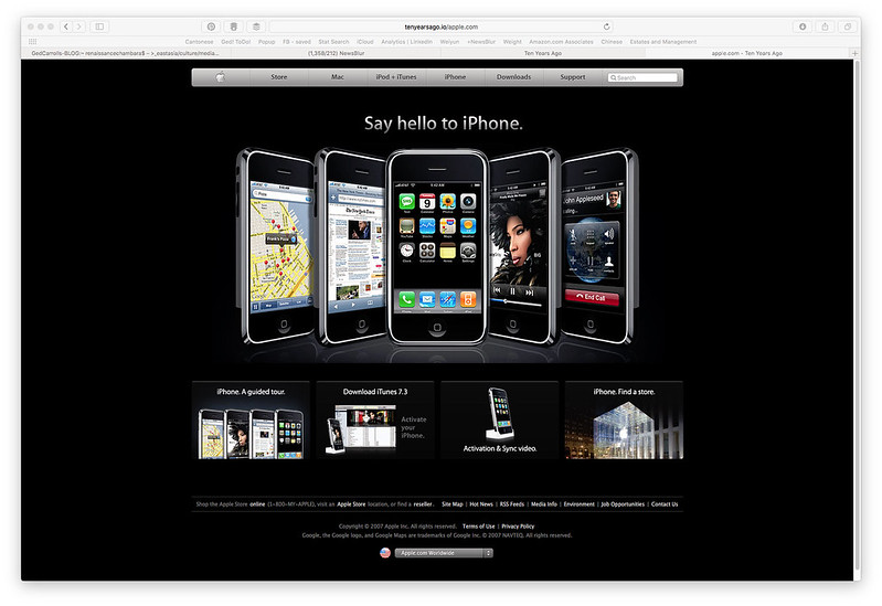
    The iPhone launch went off with the characteristic flair you would expect from Steve Jobs. It was a nice looking handset. It reminded me of Palm Vx that I used to have, but with built in wireless. Whilst the Vx had a stylus, I had used my fingers to press icons and write Graffiti to input text. It looked good, but it wasn’t the bolt from the blue in the way that others had experienced it.

    But in order to do work on the Palm, I had a foldable keyboard that sat in my pocket.

    By the time that the iPhone launched, I was using a developer version of the Nokia E90 which had an 800 pixel wide screen and a full keyboard in a compact package.

    Nokia e90 and 6085

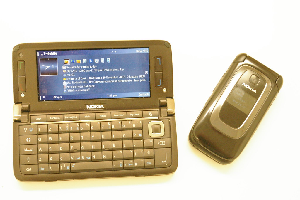
    I had Wi-Fi, 3 and 3.5G cellular wireless. I could exchange files quickly with others over Bluetooth – at the time cellular data was expensive so being able to exchange things over Bluetooth was valuable. QuickOffice software allowed me to review work documents, a calendar that worked with my Mac and a contacts app.  There was GPS and Nokia Maps. I had a couple of days usage on a battery.

    By comparison when the iPhone launched it had:

    • GSM and GPRS only – which meant that wireless connectivity was slower
    • Wi-Fi
    • Bluetooth (but only for headphone support)
    • No battery hatch – which was unheard of in phones (but was common place in PDAs
    • No room for a SD, miniSD or microSD card – a step away from the norm. I knew people who migrated photos, message history and contacts from one phone to another via an SD card of some type

    I wasn’t Apple’s core target market at the time, Steve Jobs used to have a RAZR handset.

    As the software was demoed some things became apparent:

    • One of the key features at the time was visual voicemail. This allowed you to access your voicemails in a non-linear order. This required deep integration with the carrier. In the end this feature hasn’t been adopted by all carriers that support the iPhone. I still don’t enjoy that feature. I was atypical at the time as I had a SIM only contact with T-Mobile (now EE), but it was seemed obvious that Apple would pick carrier partners carefully
    • There was no software developer kit, instead Apple encouraged developers to build web services for the iPhone’s diminutive screen. Even on today’s networks that approach is hit-and-miss
    • The iPhone didn’t support Flash or Flash Lite. It is hard to explain how much web functionality and content was made in Adobe Flash format at the time. By comparison Nokia did support Flash, so you could enjoy a fuller web experience
    • The virtual keyboard was a poor substitute for Palm’s Graffiti or a hardware keyboard – which was the primary reason that BlackBerry users held out for such a long time
    • The device was expensive. I was used to paying for my device but wasn’t used to paying for one AND being tied into an expensive two year contract
    • Once iPhones hit the street, I was shocked at the battery life of the device. It wouldn’t last a work day, which was far inferior to Nokia

    I eventually moved to the Apple iPhone with the 3GS. Nokia’s achilles’ heel had been its address book which would brick when you synched over a 1,000 contacts into it.

    By comparison Apple’s contacts application just as well as Palm’s had before it. Despite the app store, many apps that I relied upon like CityTime, MetrO and the Opera browser took their time to get on the iPhone platform. Palm already was obviously in trouble, BlackBerry had never impressed me and Windows phone still wasn’t a serious option. Android would have required me to move my contacts, email and calendar over to Google – which wasn’t going to happen.

    SaveSave