1 minutes estimated reading time
Whilst looking for the new BBC ‘Reith’ font – which they’ve done in-house to update Gills Sans and not pay licence fees, I came across this interesting specification on global web page design by the BBC.
Mark Ovenden talks about the new font as part of a wider appreciation of Gill Sans and Johnston (the London Underground font) in a BBC 4 documentary. It was interesting to hear how Neville Brody used it in City Limits magazine and the challenges these fonts faced in the move to digital – first of all for graphic design and then for online consumption.
Finally, from a font perspective, I found this video from Apple WWDC 2015 that Apple used to introduce its San Francisco family of typefaces as its system font (they also use it as their corporate font now). This was the first font designed in-house at Apple in 20 years. Apple keeps it tightly controlled and restricts access to it.
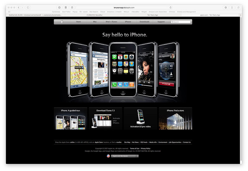
I looked back on Apple’s website from 10 years ago following the launch of the iPhone I realised how fad driven web design could be.
In particular notice the reflection was very now at the time. Javascript had taken off with web 2.0 and someone came up with a block of code that did reflections on images a la the image effect you can get in PowerPoint. This then drove a wider trend to do this in code or in InDesign. You can blame the font gradient on a similar ‘cool Javascript hack’ to design trend meme as well.
