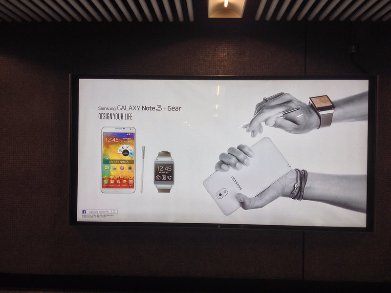
Samsung have been using pretty much the same imagery across print and out-of-doors advertising which not only features awkward wearables but manages to to makes the entire Galaxy suite of phablet, stylus and watch look awkward.
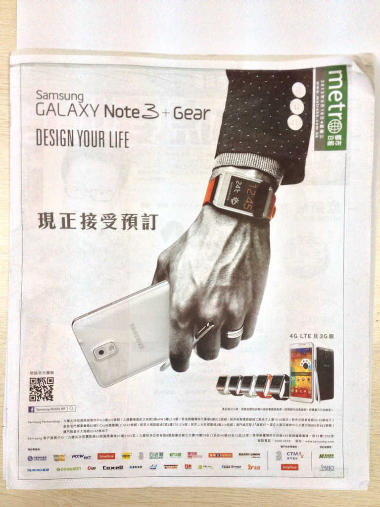
I first noticed it on the front page takeover of the free Chinese language paper Metro (HK edition). It makes no sense. The large size of the watch alone fulfils the awkward wearable criteria. But the stylus popped between the middle fingers hides the fact that it can actually be stored inside the Note series phablet. The vertical position of the hand is designed to maximise the portrait orientation of the ad space, but makes it look as this is how you would walk along with the devices.
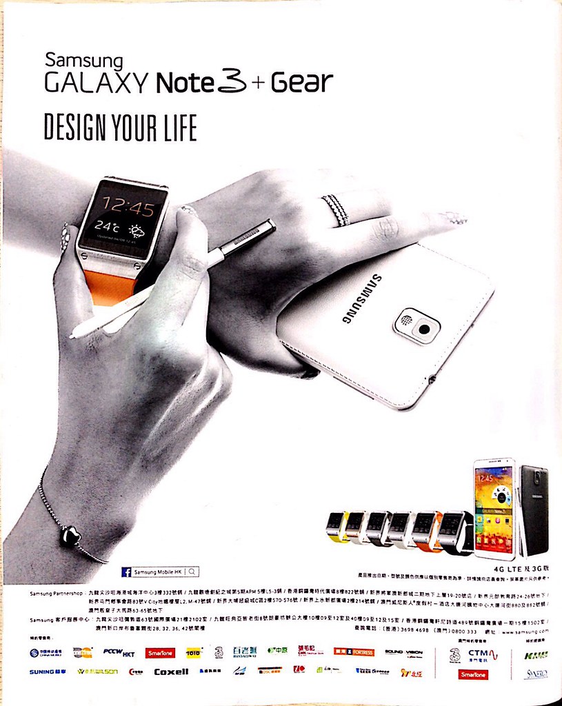
A lady version inside the South China Morning Post. If you were using a smartwatch surely you’d have stowed away the stylus? And the hand grip makes the Gear smartwatch look larger than a G-Shock emphasising awkward wearables as a concept.
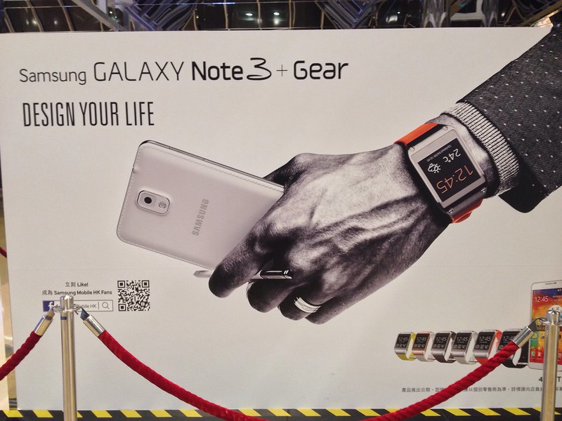
Pop-up store in Cityplaza. The gentleman from the Metro advert image is moved through 240 degrees, he’s moving with purpose, but he’s still wearing awkward wearables.
I am not quite so sure what is going on in this picture. The screen on the Gear smartwatch fulfils that awkward wearables look. Too cumbersome to be truly glanceable as a device. I am also not too sure what the model is going to do with the back of the device based on her grip and the stylus position.
A lady version, this time with a pink phone, again on the MTR
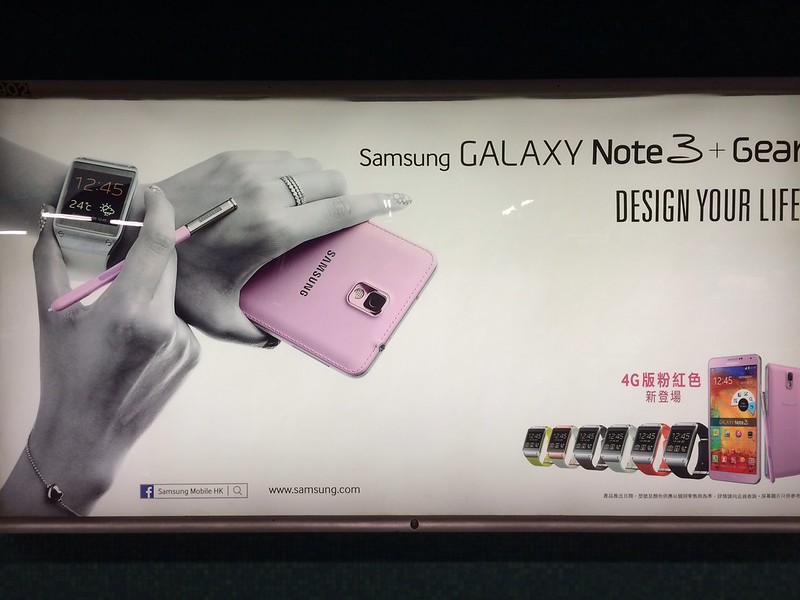
Again this advert manages to destroy the user context of wearable devices. Part of it is trying to get the Palm like stylus of the Note series device in the shot but the result is an awkward wearables scenario. And the cliched pink device for a lady isn’t great either. More related posts here.
