Category: design | 設計 | 예술과 디자인 | デザイン

Design was something that was important to me from the start of this blog, over different incarnations of the blog, I featured interesting design related news. Design is defined as a plan or drawing produced to show the look and function or workings of a building, garment, interfaces or other object before it is made.

But none of the definition really talks about what design really is in the way that Dieter Rams principles of good design do. His principles are:

  1. It is innovative
  2. It makes a product useful
  3. It is aesthetic
  4. It makes a product understandable
  5. It is unobtrusive
  6. It is honest
  7. It is long-lasting
  8. It is thorough down to the last detail
  9. It is environmentally-friendly – it can and must maintain its contribution towards protecting and sustaining the environment.
  10. It is as little design as possible

Bitcoin isn’t long lasting as a network, which is why people found the need to fork the blockchain and build other cryptocurrencies.

Bitcoin uses 91 terawatts of energy annually or about the entire energy consumption of Finland.

The Bitcoin network relies on thousands of miners running energy intensive machines 24/7 to verify and add transactions to the blockchain. This system is known as “proof-of-work.” Bitcoin’s energy usage depends on how many miners are operating on its network at any given time. – So Bitcoin is environmentally unfriendly by design.

On the other hand, Apple products, which are often claimed to be also influenced by Dieter Rams also fail his principles. They aren’t necessarily environmentally friendly as some like AirPods are impossible to repair or recycle.

  • Things that made my day this week

    Dragon Ball characters appear in Ford anime ad specifically made for English-speakers 【Video】 – unfortunately it is unavailable in the UK, there must be some kind of geography-related images rights licensing issue with Dragon Ball. That’s a shame as it looks like a beautiful bit of work for Ford

    Great idiosyncratic video that talks about the kind of product design considerations customers need to think about in buying a quality bag. The less seams that you have, the less points of failure that you have in the bab. More design content here.

    Pressure Scale – great iPhone hack as a HTML 5 web app. It uses the iPhone’s own sensors to provide a pressure gauge. This goes to show the Swiss Army knife nature of smartphones.

    Quentin Tarantino has a reputation for interpolating other film makers work, that he picked up from his time working behind the counter of a great video rental store called Video Archives in Manhattan Beach, California. When it closed down he bought their complete catalogue of content. Some of this won’t have made it to digital formats such as Blu Ray or streaming. I presume that he’ll never be bored, with that comprehensive a film library.

    Hungry for more clicks, Zomato is running a killer marketing campaign on porn sites – PornHub has also done similar campaigns with the likes of Diesel jeans. There is a wider ethical discussion to have around this.

    Where the line falls will depend on the customer base and the corporate brand.

    Whilst it might be right for Axe or Lynx male grooming products, that doesn’t mean that Unilever should do it because of its corporate stance and the knock on effects to the likes of Dove.

    On the other hand, a brand that thrives on controversy like Dolce & Gabbana might be a much better fit.

  • Priv fails + more things

    BlackBerry sold under 50,000 Priv units, Play Store data suggests | AndroidAuthority – its probably over this number as many BlackBerry Priv devices wouldn’t be allowed to download apps from the Play Store for enterprise security reasons, but it isn’t a blockbuster either. More on wireless related subjects here.

    Home Broadband 2015 | Pew Research Center – plateaued with some relying solely on mobile broadband WTF

    Markets in everything, tangled and untangled – real world self selecting gamefication

    Uber needs more drivers in China. A partnership with a state-owned carmaker will help – Quartz – Uber faces formidable competition in China, mainly from Didi Kuaidi; which explains why its trying to get some ‘vendor financing’ for its ‘non-employees’. It has done a similar deal with General Motors in the US

    In Net-a-Porter and Yoox Merger, a Fight Behind the Scenes – New York Times – (paywall)

    The Huawei Watch might be the smartwatch for me (REVIEW) – Tech in Asia – If you absolutely, positively, want a smartwatch, if you’re an Android user, and if you care about how the thing looks on your wrist, the Huawei Watch is close to the best option for you (it also works with iOS, although with limited functionality). It strikes just the right balance between usability and design, looking equally at home at a dinner party or a tech event. Unfortunately, it costs twice as much as most of its Android Wear competitors, between S$549 and S$649 (about US$399 in the States).

    Women Fuel China’s Fitness Craze – WSJ – reminds me of the ‘All in with my girls’ work done by B-M when I was there

    How 19 Big-Name Corporations Plan to Make Money Off the Climate Crisis | Mother Jones – silver linings in them clouds

    Here’s What We Need to Do to Get VR to Take Off | Andreessen Horowitz – or why non gaming content is likely to drive VR uptake first

    Can’t sign in to Google calendar on my Samsung refrigerator – Google Product Forums – a sign of things to come

    Why can’t China make a good ballpoint pen? | Marketplace.org – the metaphysics of quality with Chinese characteristics

  • My 10 most popular (trafficked) blog posts of 2015

    These are the ten most trafficked posts of 2015, in reverse order:

    Throwback gadget: Nokia N900 – I tried Nokia’s first Maemo-based phone. It was amazing how useless it was as one forgets how linked the modern smartphone is to web services. Despite these problems one could see the now lost potential of the phone. More on the Nokia N900 at GSMarena.

    Generational user experience effects – a meditation on user experience from the analogue era to the present

    2015: just where is it all going? – I had a think about where digital and technology would go over the next 12 months or so. You can see how I did here.

    Reflecting on Yahoo!’s Q2 2015 progress report on product prioritisation – by June this year, the product rationalisation that Yahoo! underwent provided ample opportunity to show that it’s core offering was collapsing in many international markets. Rather than it being a market wide condition, the data pointed to Yahoo! specific issues.

    Traackr – beyond the buzzword event – a post about how a diverse range of organisations from Coca-Cola to a luxury jeweller were thinking about influencer marketing.

    Throwback gadget: Made 2 Fade (by KAM) GM-25 Mk II phono pre-amp and mixer – a review of a mixer that has been lost in dance music culture history, yet was responsible for much of its popularity outside the super clubs.

    That Jeremy Clarkson post (or lies, damn lies and sentiment analysis) – or why everyone from the mainstream media to PR Week got the story so wrong about Jeremy Clarkson’s departure from Top Gear.

    An experiment on fake Twitter followers – I spent some of my hard-earned cash to see what difference if any buying fake followers had. I chose Twitter as a channel mainly because it would be easier to measure any impact, otherwise it could have just as easily been Facebook followers, Pinterest subscribers or Instagram followers. My overall conclusion on the fake follower business is that it almost purely about personal vanity rather than gaming a system.

    O2O (online to offline) or what we can learn from the Chinese – East Asia is way ahead of marketers in the west in terms of multi-channel marketing particularly the integration of of online with offline aspects.

    48 hours with the Apple Watch – hands down the most popular post of this year on my blog was my short experience living with the Apple Watch. I felt that it was a nicely designed, but un-Apple experience. It also convinced me that the use case for wearables wasn’t here yet.

    That’s the end of my posts of 2015.

  • Zoetrope + other things

    Zoetrope based on a number sequence

    Amazing zoetrope based on Fibonacci sequence made using 3d-printing – just mesmerising. The strobing effect reminded me of the strobe edge on the Technics SL-1200 turntable. The zoetrope were moving images before film or television existed. This embedded the zoetrope in a wider steam punk aesthetic that harked back to the Victorian and Edwardian age. John Baird used some of the visual effects that a zoetrope has in the electro-mechanical mechanism of his original television system.

    Road readers programme

    Honda Turns Car Time Into Story Time With ‘Road Readers’ Program – Print (video) – Creativity Online – smart work by Honda. It deals with the ‘are we there yet’ yet problem that emanates from the back seat during medium to long journeys. It is a world away from the focus on driving experience that car marketing usually does.

    Zegna

    Zegna celebrates family togetherness with multi-generation gift guide – Luxury Daily – really nice idea that ensures your family gets presents that you’d actually like. It deals with the awkwardness of intergenerational gift giving exemplified by Bart Simpson socks and Old Spice gift guides. For Zegna’s perspective it also allows the brand to build a relationship with the children and grandchildren of current customers. Its an interesting approach to building those mental models for the brand. More luxury-related content here.

    Bizarre Tinder ads

    Amazon Looks To Recruit Engineers With Bizarre Tinder Ad | Motherboard – this looks at first glance an attempt to target brogrammers. I wonder what was the insight that drove this whole campaign? The whole thing feels so odd and out of context. Alongside the nazi branded tube train to promote Man In The High Castle this feels one of Amazon’s odder marketing decisions.

    Vogue China

    It is interesting hearing about the role that Vogue China played in ‘building’ the fashion industry in China including getting Chinese models on the world stage. Why had they been ignored previously?

  • Generational user experience effects

    This post fell out of a conversation I had about mobile applications in particular SnapChat. The idea of generational user experience effects came from my own experience of consumer electronics. This  crossed over from wired and analogue devices through to the present day, which provides me with a wide perspective on how things have changed.

    My parents grew up in an environment where the four most complex devices they would have been exposed to as a child were a watch or clock, the household radio, a sewing machine owned by the local seamstress and the piano or organ in the parish church.

    Form follows function

    I was just old enough to remember electricity coming to the family farm were my Mum grew up. The 1960s vintage Bush TR82C radio still ran off a battery until the mid-1980s.  This provided the agricultural mart price changes and weather forecast, as well as the musical entertainment on a Saturday night. Non-rechargeable batteries were relatively expensive and battery operated devices where used sparingly.

    My Dad saw electronics enter industry, where previously electro-mechanical systems and pneumatic circuits had driven simple processes that would now be governed by a microprocessor.

    They were fine with new appliances and even the new 1970s Trinitron TV with touch controls; hi-fis and kitchen appliances usually had neatly labelled buttons that may have had logic controls rather than the physical ‘clunk’ of a mechanically operated mechanism behind them.

    This is the kind of generational user experience that Dieter Rams developed. The nature of the design if done well made the operation seem self evident.
    Sony Walkman DD

    Modal interface design

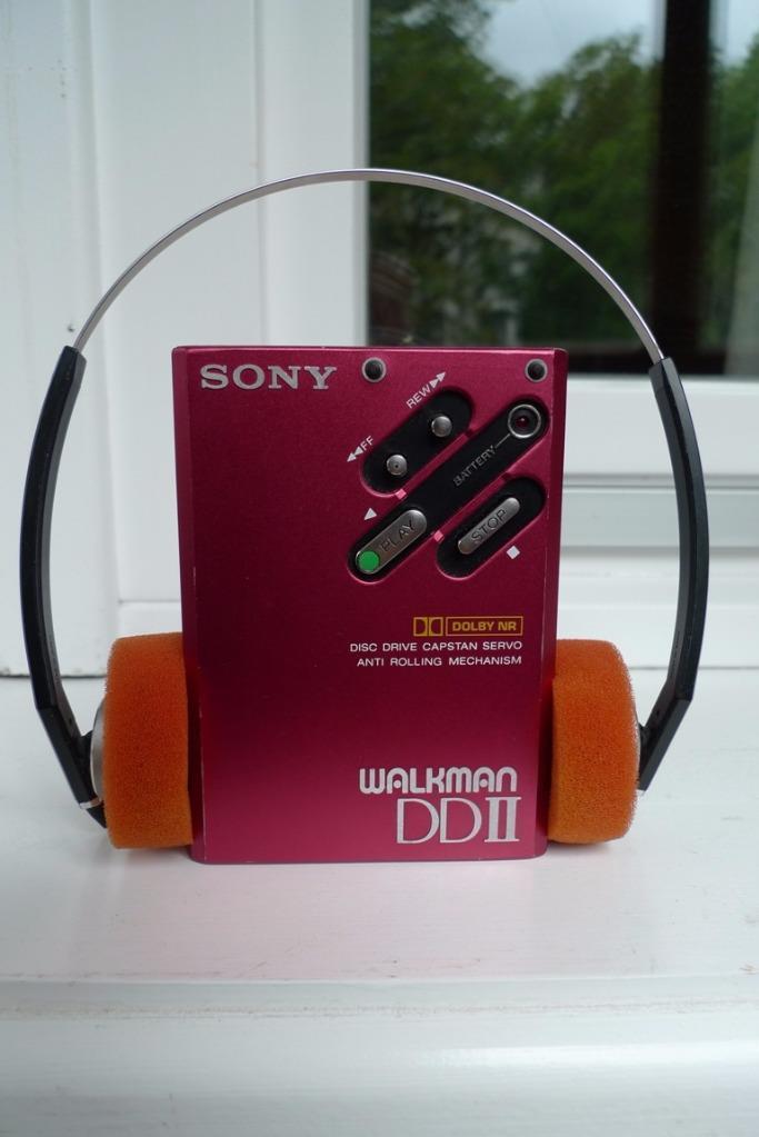
    The problems started to come with digital watches and VCRs (video cassette recorders).  The user experience in these devices were different than anything that had gone before. VCRs and digital watches were like the computers of their day modal in nature.

    You had to understand what mode a device was in before you could know what pushing a given button would do.  In my case this wasn’t an intuitive experience, but I got there by reading the manual. If you own a G-Shock or similar Casio watch, you still experience this modal experience, this is the reason why a G-shock comes with a user manual the size of two packs of gum. g-shock modal nature
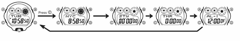
    My Dad had the head to deal with these technologies but didn’t have the time to go through the manuals. In the late 1980s / early 1990s Gemstar launched a simple way of programming the video with the correct time and channel with a PIN number for each programme that was between six and eight digits long. It was known by different names in different regions; in Europe it was called VideoPlus. And it was easy enough for anyone who could use a touchpad phone to grasp. Panasonic launched a rival system based on scanning barcodes that wasn’t successful, though programming sheet still goes for £10 or so on eBay.

    VideoPlus allowed me to skip duties as the household VCR programmer. But I didn’t get away from modal interfaces.

    Menu driven interfaces where all the rage with friends digital synthesisers. None more than the Yamaha DX-series, which not only had a complex way of creating sounds and a byzantine menu system of accessing them. Knobs and dials in interfaces were expensive, menus driven by software were virtually free once the software was written – and the microprocessors to drive them continued to drop in cost. This was one of the main reasons why albums from that time often credited someone with being a ‘MIDI programmer’. From a manufacturing point of view robotic pick-and-place machines that automated the manufacture of consumer electronics (until the rise of the hand-assembled Chinese electronics from Foxconn) were an added driver for having ‘dial-less’ circuit boards.

    During the day, I worked with a range of computers at work and my first email account was on a DEC VAX as part of the All-In-1 productivity suite; think of it as a Google services type application on a private cloud with a ‘command line’ like interface that operated on the same modal principles as the VCR or digital watch.

    All-In-1 had a simple email client, word processor, a ‘filing cabinet’ – think of it as Google Drive and the front end of business applications – we used VAX for stock management and to order supplies.

    Given the spartan interface, it seemed appropriate that I learned how to touch type on an application for the VAX – mainly because after you had read the newspaper cover-to-cover there wasn’t much to do on a night shift.

    We had a few other computers in the labs for running test equipment, usually some sort of DOS, a couple of Unix-variant boxes (HP, SGI and a solitary Sun Microsystems machine), an Amiga (because they had handy features for video) and  Macs.

    WIMP

    I naturally gravitated towards the Mac. Once you got the hang of the relationship between the movements of the mouse and the cursor on screen, the interface of Windows Icon Mouse Pointer (WIMP) was remarkably similar to the form follows function design of analogue consumer electronics. Interface design aped real-world button designs, folders and filing cabinets, even waste paper baskets. Even the spreadsheet mirrored a blackboard grid used at Harvard University to teach business students.

    Once one you had got used to the WIMP environment it was remarkably simple. More complex devices required menus but for many applications, once you knew some basic rules you were up and running. Part of this was down to Apple laying down interface standards so cmd Q meant quit an application, cmd C meant copy, cmd X meant cut and cmd V meant paste in any programme.

    This was something that Microsoft took as a design lesson for themselves when making Windows, however it was interesting that they started to break these rules in applications like Outlook.

    Things became more complex with applications like Adobe PhotoShop which became so feature rich, it meant that there was more than one right way to achieve a particular task, so instruction manuals tend to be of limited value.

    The leap from WIMP to hyper-media was a small one, the act of clicking on a link was relatively easy. What one didn’t realise at the time was the new world this opened up. We went from interlinked documents to surreal worlds created in Macromedia Flash and similar authoring tools on CD-ROMs and eventually the web. An immersive experience was promised that was never fully delivered mainly because we expected William Gibson’s Sprawl trilogy to be our manifest destiny.

    Icons under glass
    MessagePad :: Retrocomputing on the green

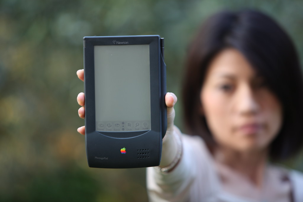
    In the early 1990s Newton had pioneered a simple version of the icons-under-glass metaphor that consumers would really take to heart with the iPhone and later Android devices. The Newton was too ambitious for the technology available at the time. The Palm series of devices pointed out the potential of icons-under-glass as a metaphor. The Palm V can be scene as a conceptual model for the modern smartphone.

    Please wait...

    With a metallic case, slim lithium ion battery that was not removable and a bonded construction were all eerily reminiscent of the industrial design for the iPhone models rolled out some eight years later.

    The launch of the iPhone marked a sea change in consumer adoption if not technology. Apple built on the prior generations of touch screen devices and improvements in technology to update the experience. They made one choice that made the iPhone stand out from its competitors, dominant player Nokia made devices that were designed to be used one handed – phones with a computer inside. Apple flipped it around so that it was selling a computer that happened to do phone things as well. When you went into a shop, it had a bigger screen and a more polished interface so was great for sales demonstrations.

    Eventually the technology started to appear everywhere. The coffee machine at work has an iOS like interface complete with skeuomorphic icons for buttons.
    Icons under glass

    Social interfaces

    In some ways, mobile interface design aped existing analogue devices. But things started to change within applications. Designers started to build applications that focused on a particular use case, which made sense given the software feature bloat that had happened on desktop applications and even web experiences like Facebook. Most social app designers haven’t managed to squeeze as much functionality out of their real estate as WeChat/Weixin. You then started to see the phenomena of app constellations where non-game single purpose apps deep linked to other applications.

    Designers started to take a minimal approach, to cut down ono the screen real estate taken up by controls.

    Instead controls only appeared in what might be broadly termed a contextual manner. The only difference that applications which have contextual menus tend to ‘telegraph’ the options and offer a help section in the app.

    I am not sure when it started but Snapchat is a prime example of this phenomena of the ‘social interface’. Their interface features are not explained by a design or manual but are more like cheat codes in a game, shared socially.  It feels like a fad, minimalism taken to an extreme, a design language that will move on yet again.

    More information

    VCR Programming: Making Life Easier Using Bar Codes | LA Times
    Quick History of ALL-IN-1 | The Museum of Email & Digital Communications
    Jargon watch: app constellation