Category: design | 設計 | 예술과 디자인 | デザイン

Design was something that was important to me from the start of this blog, over different incarnations of the blog, I featured interesting design related news. Design is defined as a plan or drawing produced to show the look and function or workings of a building, garment, interfaces or other object before it is made.

But none of the definition really talks about what design really is in the way that Dieter Rams principles of good design do. His principles are:

  1. It is innovative
  2. It makes a product useful
  3. It is aesthetic
  4. It makes a product understandable
  5. It is unobtrusive
  6. It is honest
  7. It is long-lasting
  8. It is thorough down to the last detail
  9. It is environmentally-friendly – it can and must maintain its contribution towards protecting and sustaining the environment.
  10. It is as little design as possible

Bitcoin isn’t long lasting as a network, which is why people found the need to fork the blockchain and build other cryptocurrencies.

Bitcoin uses 91 terawatts of energy annually or about the entire energy consumption of Finland.

The Bitcoin network relies on thousands of miners running energy intensive machines 24/7 to verify and add transactions to the blockchain. This system is known as “proof-of-work.” Bitcoin’s energy usage depends on how many miners are operating on its network at any given time. – So Bitcoin is environmentally unfriendly by design.

On the other hand, Apple products, which are often claimed to be also influenced by Dieter Rams also fail his principles. They aren’t necessarily environmentally friendly as some like AirPods are impossible to repair or recycle.

  • Palm troubles

    First of all some disclosure: I worked on the Palm account at my agency some ten years ago now and got to work with some of the smartest people in mobile device technology, notably the company’s chief competitive officer Michael Mace as an occasional media spokesperson back when his pictures had him with a Magnum PI-style moustache.

    At the time I worked on the account the company was riding high on the PDA boom, but the seeds of its current problems were sown back then.

    Even after working on the Palm account, I was a Palm customer. I had a Palm Vx which I used to death (quite literally) and spent a fortune on accessories including a Rhinoskin titanium slider hard case and a ThinkOutside portable keyboard. After that  I had a number of other Palm devices: a m515, a Tungsten3, a Treo 600 and a Treo 650.

    The last device left such a bad taste in my mouth because of an address book full of duplicates and corrupted data that I migrated to Nokia E-series devices, which provided a superior experience to the Treo 650 despite serious software stability issues.

    The company has been buffeted by critics over the years, many of them well-meaning.

    With the arrival of Jon Rubenstein to give it flare and product smarts and a matching injection of new money into the company, there was every chance that Palm could reinvent itself.

    Unfortunately it didn’t, and the company is now reaping the fruits of mediocre labours.

    To be honest the signs where there that the new product line wasn’t great and I wasn’t surprised:

    The communications-related signs are particularly damning as they indicate that at least some insiders at the company may have realised that the product despite the hoopla was not ready for primetime.

    Palm Pre

    The second good sign of a bad device is when after a decent amount of time virtually no one that you know owns one. I only know one person: the fashion-forward Rise co-founder Paul Allen; however on this occasion the Palm Pre has turned out not to be a fashion classic and more like a gadget equivalent of MC Hammer’s parachute pants.

    Interestingly, in his letter to Palm employees, Rubenstein puts much of the weight of corrective action on working short-term tactics with carrier partners to create demand push with no clue about what execution improvements in terms of product redesigns and quality improvements (if any) would be coming to shore up a poor customer experience. More gadget related content can be found here.

  • The electric scooter

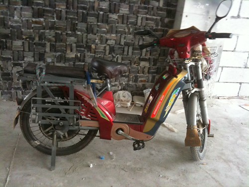
    One of the first things that I noticed about the Shenzhen streets was the prevalence of the electric scooter. They are ridden by young people and old people. They’re used for delivery services, commuting to and from work and going to the buy the groceries.

    They aren’t slick looking Tron light bike type conveyances, or Something worthy of Shotaro Kaneda’s bike that would fit into the Neo Tokyo-like streets of central Shenzhen. Instead the electric scooter looks like an emaciated Honda Cub. It all comes across a bit half-arsed.

    Electric scooter, originally uploaded by renaissancechambara.

    They represent the cheapest form of powered transport in urban China.

    These are probably the scariest things that you are likely to encounter in China, short of being invited to drink tea with the authorities. They are fast enough to be dangerous, but slow enough to be annoying for other road users. They make no sound, not even the rushing of tires on road surface.

    The riders tend to have little skill and view fellow road users as potential targets. They are also not ridden only ridden on the road, but on the pavements and pedestrians have to be constantly in a high state of vigilance watching out for errant electric scooter riders. This being China, no fucks are given. If you wipe out on the pavement, they’ll just ride on. They’re absurdly dangerous.

    Finally, given that most of China’s electricity supply comes from coal fired power stations; and your scooter will last a few years at best – their green credentials are somewhat lacking. More design related content here.

  • Classy Kiss yoghurt drink

    While staying in Shenzhen, I came across Classy Kiss yoghurt drink. At first I was a bit thrown, the European Dickensian vintage illustration was at odds with the product name.

    The name was the only English apart from <- Open on the package.

    Classy Kiss yoghurt drink, originally uploaded by renaissancechambara.

    So why have the name in English and why European people on the packaging? Here are a few likely factors:

    • Chinese people up until recently generally didn’t consume dairy products, so a ‘foreign looking’ brand might make more sense. It came into vogue when they wanted taller stronger kids and had the economic purchasing power to buy a higher protein diet. The old illustration likely conveys heritage (and so trust) of some sort
    • Most Chinese people wouldn’t know what the packaging was saying in English. They also wouldn’t appreciate the odd typography. It would probably feel balanced to a Chinese eye and not too out of step with the feel of the Chinese ideograms
    • It will contrast on the shelf against the clean modernist packaging of western brands like Danone, or General Mills’ Yoplait

    As for the ‘Open’; that was likely on the InDesign file template for the TetraPak packaging. I wouldn’t say that the product is like a classy kiss, but it is a perfectly passable yoghurt drink. More FMCG related posts here.

  • Heirloom Design

    Saul Griffith in a presentation he gave as part of the Long Now Foundation talked about the environmental impact of our stuff. The possessions that we own make up about a quarter of our lifetime carbon footprint. The way to reduce this is to have stuff that lasts longer, and that we want to keep longer. From this came the idea of heirloom design.

    IMGP0699.JPG

    It isn’t new, Sotherby’s and Christies have made very good businesses selling old stuff, Patek Phillipe talks in advertisements as the watch-owner not actually being the owner but the custodian to pass the timepiece on to the next generation and Rolex has an excellent reputation for taking lifelong care of watches it sells.

    1.JPG

    So its a new framing of an old idea, it has been adopted by some eco-conscious businesses such as Howie’s Hand-Me-Down range: a set of bags and a jacket that are so well made and so durable that you want to keep them for their natural life. The examples that are given are a Montblanc pen and a Rolex watch; both of which require considerable upfront investment as well.

    Dieter Rams

    However design also has a case to play in this: look at the prices on eBay for a genuine Charles Eames recliner, or any of Braun’s consumer electronics offerings; classic cars fetch a far higher premium than their newer, more sophisticated cousins because of their styling.

    A second factor comes into heirloom design: design for servicing. Pretty much every part on my Technics turntables are replaceable, contrast this with the Denon DVD player I had which I had spent similar money on, yet the manufacturers couldn’t repair as they didn’t have the parts; or my Nokia E90 communicator which would have cost more to repair than two new Nokia E-series phones. Nokia’s Vertu phone range with their over-engineered cases and dealer-replaceable future proof guts may be the way forward.

    The personally most ironic thing for me is that my Dad has bemoaned the quality with which things have been made for the past 30 years and is a staunch believer in progress through industry may finally have something to agree with the environmentalists on.

    A number of brands practice heirloom design already but don’t shout about it:

    Suggestions from a quick poll I did on Twitter included

    • Bialetti with their user serviceable coffee pots
    • Caterpillar
    • Timberland
    • BMW – they certainly have the service network and they have built up a reputation for having a good build quality
    • Kenwood – the shortwave radio and communications manufacturers
    • TAG (presume they meant TAG Heuer) – not too sure that I would agree with this one, or some others suggested such as Apple, Panasonic and Sony; at least in their consumer goods especially with Panasonic doing away with the 1200 series of turntables
    • DEWALT
    • Dyson
    • Le Creuset
    • Mag Instrument Inc. (Maglite torches)
    • The North Face
    • Stanley Hand Tools
    • Aga
    • Herman Miller – particularly the Aeron chair
    • Cyrus Audio
    • Stokke prams, car seats and other stuff for early childhood
    • Tumi luggage

    Kudos in no particular order to Ruby Quince, Ana Mangahas, Becky McMichael, Stephen Holmes, Tom Wynne-Morgan, Robin Clark and Abigail Harrison for their heirloom design suggestions.

    Which brands do you think represent great heirloom design? Feel free to leave a comment. More design related posts here.

  • Black precious resin & Montblanc

    I had a short haul flight and went over the duty free catalogue on Swiss Airlines. This section on Montblanc pens stuck out at me because of its wording. Each pen was described as being made of ‘black precious resin’. Click on the image if you want to see a larger version.

    Precious Resin Montblanc spiel

    So what does black precious resin actually mean? One would presume some form of black shiny plastic, which doesn’t seem quite so precious. Now the use of plastic isn’t a bad thing in pen manufacture. For instance fellow German writing instrument manufacturers Pelikan and Kaweco both make writing instruments out of plastic, but they also don’t charge over 300 pounds for a ballpoint pen.

    Plastic feels thoroughly modern. It defined the post-war world and accelerated further with globalisation. Black precious resin isn’t particularly rare in itself like ebony wood or precious metals. 

    What the black precious resin explanation misses is the real elements at the heart of Montblanc’s authenticity:

    • History: Montblanc is actually over a century old as a firm
    • Country brand: It’s pens are still made in Germany, so it can take advantage of the German country brand: precision manufacturing excellence and craftsmanship
    • Craftsmanship: making a pen write smoothly is an art, too much ink and you will get splodges. A badly designed nib or ballpoint mechanism will scratch the paper, deliver the ink unevenly and even stain the writer
    • Design: One of the reasons why Montblanc managed to upset A.T. Cross in the market for luxury pens because their pen design feels much better in the hand because of its fuller barrel size

    But none of these factors are reflected in the description of the Montblanc pens featured in the duty-free catalogue, instead we get smoke-and-mirrors which engenders distrust and makes for an authenticity FAIL.