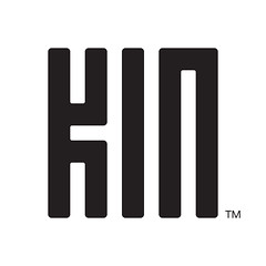
Whilst I won’t be dashing out and getting myself one of the Microsoft | Sharp Kin phones. I did like the Kin logo. The logo seems to be completely unrelated to the devices. It’s an atemporal brand design it would be easy to produce on screen, as an app icon or in print and also looks as if it draws heavily on Asian influence.
You wouldn’t need to be able to read the characters to at least recognise the brand. With that in mind it would work in markets around the world.
All of that is makes for a really challenging design brief and the work done on the Kin logo is very impressive.
I’d go as far as to say that the Kin brand and products are unworthy of the Kin logo design

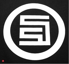
There is a noticeable stylistic similarity to the S|Double Studio logo from Shawn Stussy’s new clothing label.

And the S|Double logo reminds me of Asian seal designs used to sign documents and mark the ownership of artworks.

This is roughly what my given name would look like on a seal or chop in Chinese characters.
There is also a resemblance to Chinese design motifs in Chinese new year and wedding decorations. The one that immediately comes to mind for me is the double happiness character set that is incorporated into designs.
Such motifs are used in a repeated pattern across fabric weave, interior design prints and carvings. There is a certain irony in that the Kin logo: one of the most modern of graphic design assignments going back designs and principles that are millennia old.
I am curious to know if the Kin logo harking back to those designs was intentional, based on design research, or if it was happenstance. Both are probable likelihoods for this project.