While staying in Shenzhen, I came across Classy Kiss yoghurt drink. At first I was a bit thrown, the European Dickensian vintage illustration was at odds with the product name.
The name was the only English apart from <- Open on the package.
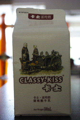
Classy Kiss yoghurt drink, originally uploaded by renaissancechambara.
So why have the name in English and why European people on the packaging? Here are a few likely factors:
- Chinese people up until recently generally didn’t consume dairy products, so a ‘foreign looking’ brand might make more sense. It came into vogue when they wanted taller stronger kids and had the economic purchasing power to buy a higher protein diet. The old illustration likely conveys heritage (and so trust) of some sort
- Most Chinese people wouldn’t know what the packaging was saying in English. They also wouldn’t appreciate the odd typography. It would probably feel balanced to a Chinese eye and not too out of step with the feel of the Chinese ideograms
- It will contrast on the shelf against the clean modernist packaging of western brands like Danone, or General Mills’ Yoplait
As for the ‘Open’; that was likely on the InDesign file template for the TetraPak packaging. I wouldn’t say that the product is like a classy kiss, but it is a perfectly passable yoghurt drink. More FMCG related posts here.