Having been involved in a number of events over the past couple of years where creative digital work intersected with experiential marketing I was keen to look at Louis Vuitton Series 3 exhibition before it closed.
Burberry tends to get the plaudits for digital experiences in the luxury sector and they do a lot of interesting work. Louis Vuitton’s initiatives like an online service that allows ladies to personalise their bag a la Nike ID.
I found it interesting that Louis Vuitton’s approach seems to have been guided by exclusivity not being the same as accessibility. There was a wealth of helpful staff, you were positively encouraged to take your own pictures – again unusual for a luxury brand, many prefer to give you content that upholds their standards.
A few touches that I really liked at the Louis Vuitton Series 3 exhibition
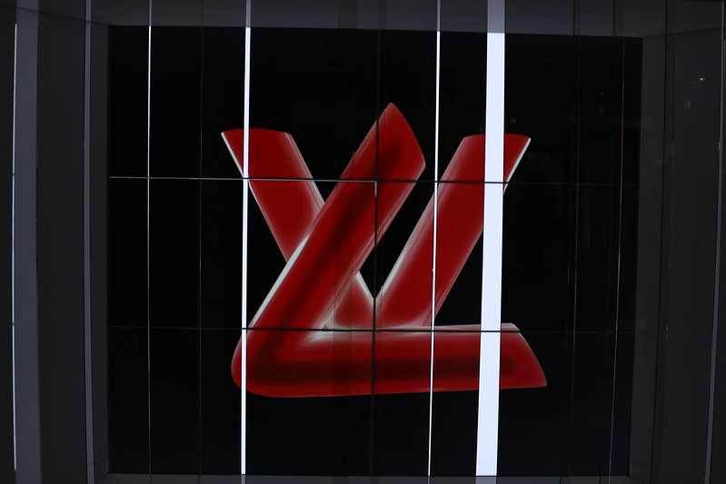
 LV logo motion graphics at the start of the exhibition, no real surprise right? What the designers did was remove the polarisers from the LCD screens so that the screens are apparently blank. The polariser is laid out in vertical strips at different distances and widths from the screen. This gives a kind of lenticular effect when you walk past it. This modern logo morphs through matrix-like digital noise and on to the more traditional LV design.

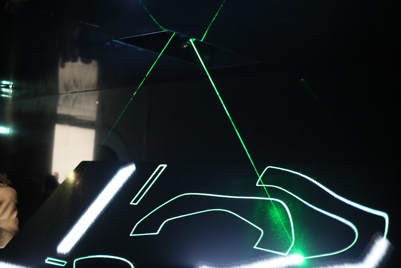
It seems absurdly simple, but the idea of using projecting mapping techniques on a flat LED screen to emphasise how Louis Vuitton products are cut from a common material before being assembled was clever. Just because you have projection mapping technology at your finger tips means that one often looks for complex shapes like building fronts rather than a flat panel.

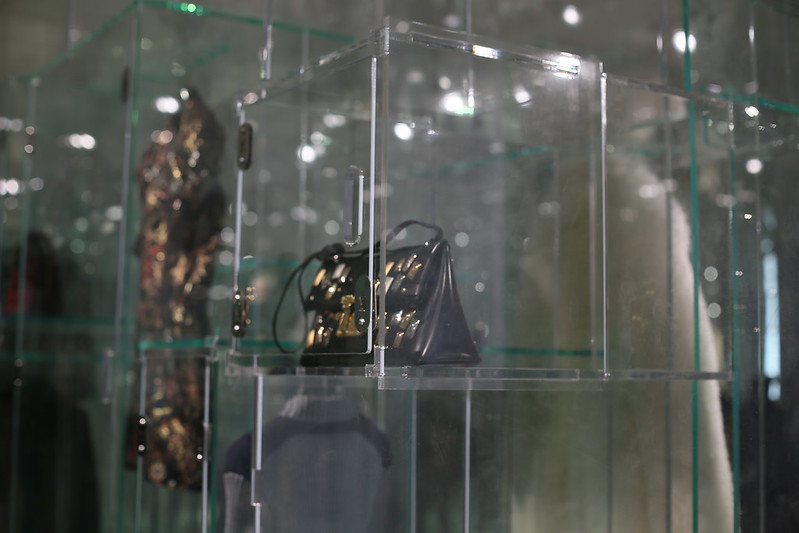
The glass bins got the balance right between protecting the product so that it doesn’t look grubby from being over-handled, whilst still making it accessible and tactile rather than a museum experience.