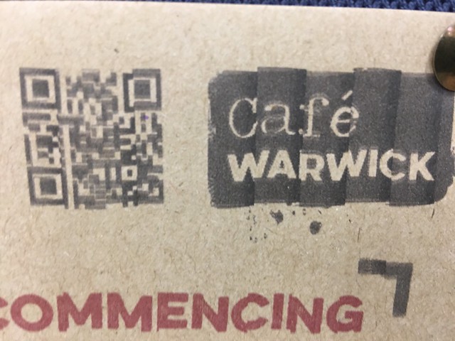
A few years ago, I was involved in a project that used a QRcode across OOH (out of home) activity for a retail launch. We had it on advertising hoardings and on the back of public transport. QRcode scanners varied in performance. In addition you had to think about:
- Contrast – did the code stand out?
- Relative aspect – would it be too big or too small for the audience to scan?
In the UK, the QRcode is seen by marketers as old hat (but then marketers and consumers in Europe didn’t ‘get’ them in the same way that their peers in Asia did). Many people don’t really understand how to use them.
Early adopters downloaded QRcode readers. But now, due to the uptake in Asian usage we will see QRcode reader function build into the phone operating system instead.

Above is the picture of the local cafe around the corner from my office. The QRcode contrast is just ok, but the glyph is too disjointed. I am not too sure if this is by design, or due to a poorly maintained inkjet printer. The image is too blurred for devices to read. I asked a member of staff about it and he told me that he thought it was some type of logo…
More on QRcodes here.